Visualizing Tabular Data#
Objectives
Plot simple graphs from data.
Plot multiple graphs in a single figure.
Questions
How can I visualize tabular data in Python?
How can I group several plots together?
Visualizing data#
Now we can compute statistics, but it’s often way more helpful and intuitive to
visualize data with plots and graphs rather than just looking at numbers.
Visualization deserves an entire workshop of its own, but’ll get started here
with the basics. To do that, we’re going to use a library called
matplotlib. Like Numpy, matplotlib is not
built-in to Python, but it’s the most popular plotting library, so it’s the de
facto standard.
Episode Prerequisites If you are continuing in the same notebook
from the previous episode, you already have a data variable and have imported
numpy. If you are starting a new notebook at this point, you need the
following two lines:
First, we will import the pyplot module from matplotlib and use two of its
functions to create and display a heat map of our data:
import numpy
data = numpy.loadtxt('data/inflammation-01.csv', delimiter=',')
import matplotlib.pyplot
matplotlib.pyplot.imshow(data)
matplotlib.pyplot.show()
Each row in the heat map corresponds to a patient in the clinical trial dataset, and each column corresponds to a day in the dataset. Blue pixels in this heat map represent low values, while yellow pixels represent high values. As we can see, the general number of inflammation flare-ups for the patients rises and falls over a 40-day period.
So far so good as this is in line with our knowledge of the clinical trial and Dr. Maverick’s claims:
the patients take their medication once their inflammation flare-ups begin
it takes around 3 weeks for the medication to take effect and begin reducing flare-ups
and flare-ups appear to drop to zero by the end of the clinical trial.
Now let’s take a look at the average inflammation over time:
ave_inflammation = numpy.mean(data, axis=0)
matplotlib.pyplot.plot(ave_inflammation)
matplotlib.pyplot.show()
Here, we have put the average inflammation per day across all patients in the variable
ave_inflammation, then asked matplotlib.pyplot to create and display a line graph of those
values. The result is a reasonably linear rise and fall, in line with Dr. Maverick’s claim that
the medication takes 3 weeks to take effect. But a good data scientist doesn’t just consider the
average of a dataset, so let’s have a look at two other statistics:
matplotlib.pyplot.plot(numpy.max(data, axis=0))
matplotlib.pyplot.show()
matplotlib.pyplot.plot(numpy.min(data, axis=0))
matplotlib.pyplot.show()
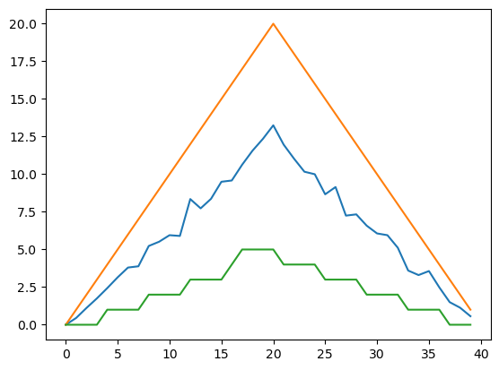
The maximum value rises and falls linearly, while the minimum seems to be a step function. Neither trend seems particularly likely, so either there’s a mistake in our calculations or something is wrong with our data. This insight would have been difficult to reach by examining the numbers themselves without visualization tools.
If we want, we can even look at all three graphs on the same plot:
matplotlib.pyplot.plot(numpy.mean(data, axis=0))
matplotlib.pyplot.plot(numpy.max(data, axis=0))
matplotlib.pyplot.plot(numpy.min(data, axis=0))
matplotlib.pyplot.show()

Importing libraries with shortcuts
In this lesson we use the import matplotlib.pyplot
syntax to import the pyplot module of matplotlib. However, shortcuts such as
import matplotlib.pyplot as plt are frequently used.
Importing pyplot this way means that after the initial import, rather than writing
matplotlib.pyplot.plot(...), you can now write plt.plot(...).
Another common convention is to use the shortcut import numpy as np when importing the
NumPy library. We then can write np.loadtxt(...) instead of numpy.loadtxt(...),
for example.
Some people prefer these shortcuts as it is quicker to type and results in shorter
lines of code - especially for libraries with long names! You will frequently see
Python code online using a pyplot function with plt, or a NumPy function with
np, and it’s because they’ve used this shortcut. It makes no difference which
approach you choose to take, but you must be consistent as if you use
import matplotlib.pyplot as plt then matplotlib.pyplot.plot(...) will not work, and
you must use plt.plot(...) instead. Because of this, when working with other people it
is important you agree on how libraries are imported.
Challenge: Make Your Own Plot
Create a plot showing the standard deviation (numpy.std)
of the inflammation data for each day across all patients.
Solution
matplotlib.pyplot.plot(numpy.std(data, axis=0))
matplotlib.pyplot.show()
Keypoints
Use the
pyplotmodule from thematplotliblibrary for creating simple visualizations.
