Visualizing data#
Now we can compute statistics, but it’s often way more helpful and intuitive to visualize data with plots and graphs rather than just looking at numbers. Visualization deserves an entire workshop of its own, but we’ll get started here with the basics. To do that, we’re going to use a library called matplotlib. Like NumPy, matplotlib is not built-in to Python, but it’s the most popular plotting library, so it’s the de facto standard.
If you are continuing in the same notebook from the previous lesson, you already have a traffic_data variable and have imported numpy. If you are starting a new notebook at this point, you need to load the data and import the library:
import numpy
traffic_data = numpy.loadtxt('traffic_data.txt', delimiter=',')
Making simple plots#
Numbers are great, but a picture is worth a thousand words. Lets learn how to make simple plots in Python. For this, we use another library called matplotlib, specifically a module called pyplot. A module is a sub-part of a library—a collection of functions and variables that are related to a specific topic. matplotlib has other modules for more complex plots, but pyplot is the simplest and most commonly used.
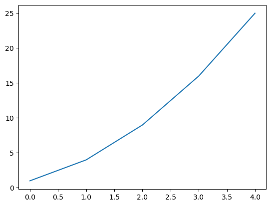
We can use the plot function to create a line graph of a list of numbers:
import matplotlib.pyplot

matplotlib.pyplot.plot([1, 4, 9, 16, 25])
[<matplotlib.lines.Line2D at 0xffffa00649d0>]
The X-axis is the index of the list, and the Y-axis is the value at that index.
It’s annoying to have to type out the matplotlib.pyplot module name every time, so we can import it with a shortcut to make that easier:
import matplotlib.pyplot as plt

plt.plot([1, 4, 9, 16, 25])
[<matplotlib.lines.Line2D at 0xffff95f599c0>]
The as keyword lets us give the imported module a shorter name. In this case, we’ve called it plt, and everytime we type plt from now on, Python will replace it with matplotlib.pyplot.
You also might notice that Python shows us a textual representation of the plot ([<matplotlib.lines.Line2D at ...>]) in addition to displaying it. We can suppress this and just get the graphical output by adding a semicolon to the end of the last line of the cell:
plt.plot([1, 4, 9, 16, 25]);
We’ll do this in the rest of our plotting code to avoid cluttering our output.
Plotting traffic data#
Now let’s get to plotting our actual data. We can get just the first row of data (the first day) using indexing, and pass this to the plot function:
first_day_data = traffic_data[0]
plt.plot(first_day_data);
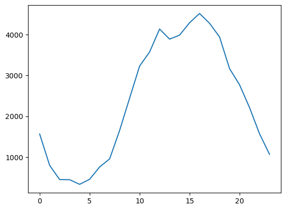
The plot shows us the traffic pattern for a single day. Traffic is low overnight, and peaks during the day.
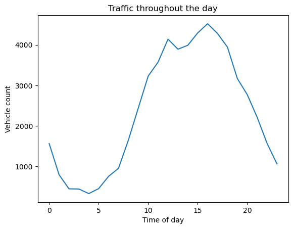
Let’s add some labels to the plot to make it more clear what we’re looking at. We do this by calling the title, xlabel, and ylabel functions:
plt.plot(first_day_data)
plt.title('Traffic throughout the day')
plt.xlabel('Time of day')
plt.ylabel('Vehicle count');
Now let’s look at all the days in the dataset on a single plot. We can do this using a loop. Calling plt.plot multiple times will add another series of data to the plot as another line:
for day in traffic_data:
    plt.plot(day)
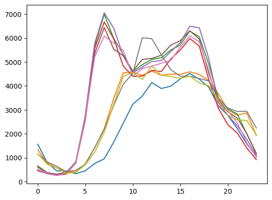
Hmm, it’s starting to look there are patterns here, but it’s hard to see what’s really going on because the plot is kind of messy with all the lines overlaid in different colors.
Examining individual days#
Let’s try plotting one day at a time to get a clearer view. Let’s look at the first three days individually:
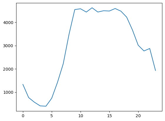
plt.plot(traffic_data[0]);
plt.plot(traffic_data[1]);
plt.plot(traffic_data[2]);
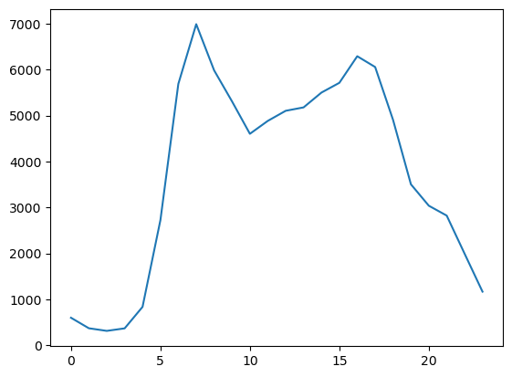
Now the pattern is starting to become clear. Days one and two have a single peak of traffic in the afternoon, but the third day has two peaks—one in the morning, and one in the evening. Does this remind you of anything? What explains this?
Try plotting the traffic for the other days, each on it’s own plot, to gather more of the pattern. After examining all the days, can you identify what distinguishes the two types of traffic patterns? Try to figure it out before revealing the answer below.
Answer
The answer is: weekdays vs. weekends.
The first two days are the weekend, Saturday and Sunday. then there are the five days of the workweek, followed by two more weekend days. The bimodal peaks on the weekdays are due to commuter traffic—people driving to work in the morning and returning home in the evening. Weekend days have a single peak later in the day when people are out and about.
In the next lesson, we’ll learn how to use another Python feature (conditionals) to distinguish between these two types of days and make the plot more clear.